Making complex investment content digestible and accessible
Citi Wealth Builder & Wealth Builder Plus
Citi added two investment products to their wealth offerings. I wrote two sets of copy in parallel with each other, making each product distinct but complimentary.
Less than 1 year after launch:
1438
open accounts
$52.5 million
assets under management

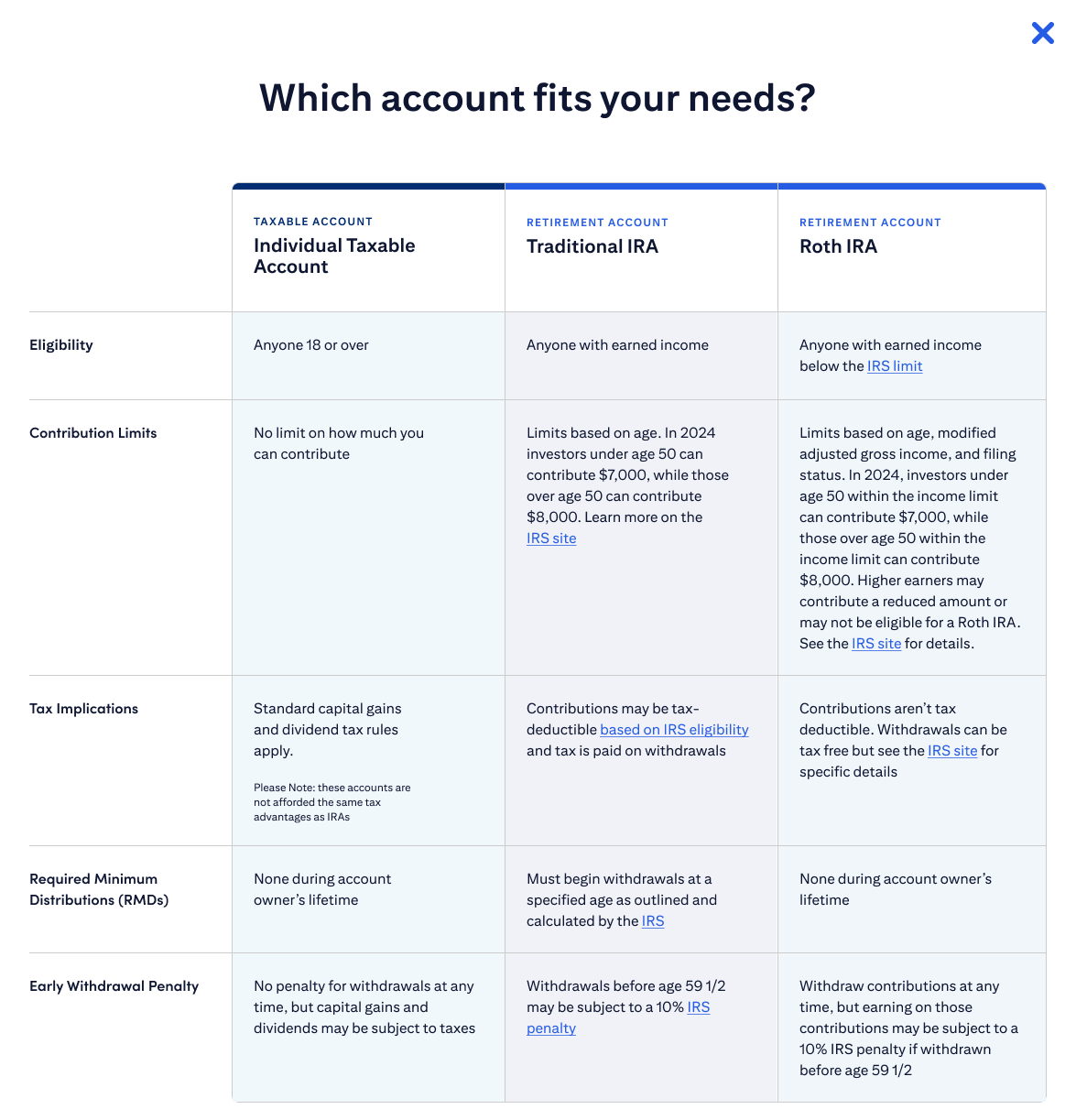
Explaining retirement accounts
The product’s main audience is users who are newer to investing, so when we added retirement accounts to Citi Wealth Builder, I wanted to pinpoint the appropriate amount of education to provide users.
To get to this answer, I wrote questions for a quantitative survey, conducted competitive research, wrote testing briefs for 1:1 user interviews, and analyzed all the results to inspire a UX solution.
One opportunity we ended up capitalizing on was an in-depth comparison chart. Among our direct competitors, this is the most comprehensive explanation of retirement accounts in an account opening flow.
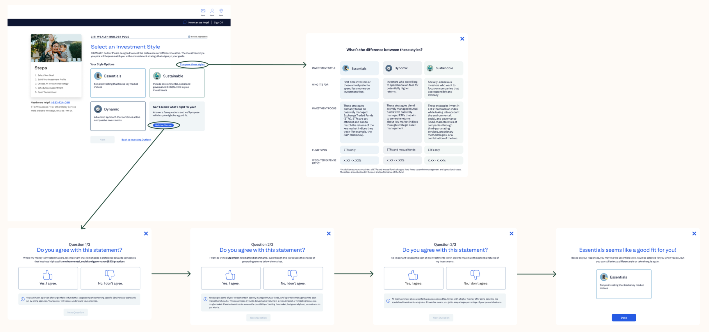
Helping users choose the investment style for them
Citi Wealth Builder offers three distinct investment styles, which affect the makeup of their portfolio. Product partners kept making additions to the style selection page, which was becoming cluttered.
When yet another requirement came in asking for an addition to the descriptions, I suggested a comparison chart in an overlay format. This allowed us to expand on the unique elements of each style while maintaining a skimmable format.
Adding a quiz
In research sessions, we repeatedly heard that users didn’t feel confident choosing an investment style with just the information we’d given so far. They weren’t sure which style would fit their goals.
In an experience often beleaguered by legal requirements, I saw an opportunity to use plainer language. Product required the “Do you agree…” paradigm, so I was able to use “I” statements for the first time, letting the user visualize themselves in each style.